Real Time Music Visualization
Reimagining How to See Music
What Is This?
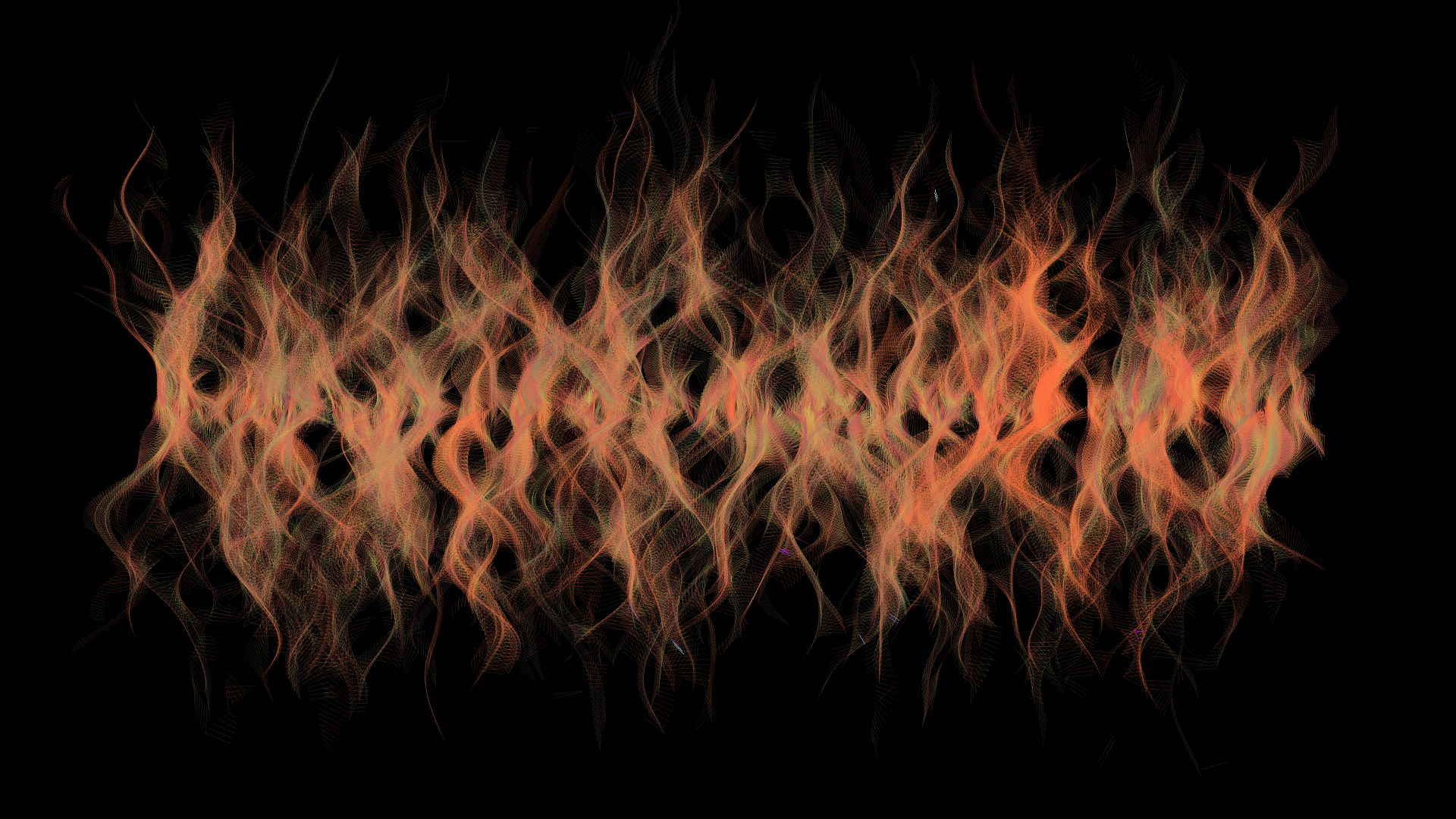
What you’re looking at is a visualization of music that I came up with. By taking in an audio file as input, it spits out a video that visualizes the music as it plays. Scroll down to see the step-by-step process of how everything comes together.
Pick Up Frequencies
Pick Up Frequencies
When the music is playing, the sound wave is like a very complex function, with random ups and downs. If we play the first five seconds of the music and feed the sound wave into a special transforming function, we will get a bunch of frequencies that are loud in the first five seconds. This special function is the Fast Fourier Transform, or FFT.
Right now, I’m omitting a lot of technicalities because I only understand FFT to the extent that I know what the things it spits out mean. (I need to catch up on my linear algebra for sure.) There are a lot of online resources about the amazing math behind the FFT.
If we keep running FFT over every second of the music while it plays, we essentially get a bunch of music notes that are being played (or sung). It is as though we reverse-engineered the audio back into sheet music.
How Notes Interact
One way to think about music is to think about the notes in relation to other notes, not in isolation. So, we can approach visualizing music by visualizing the interactions between different notes.
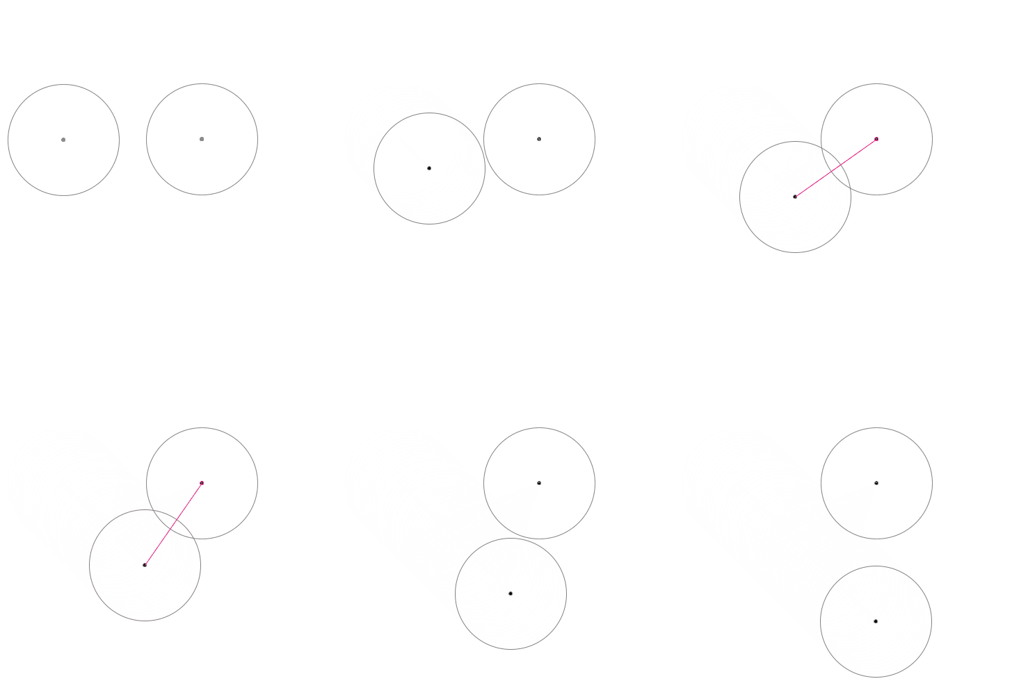
Let’s create two circles in 2D space to represent two musical notes. Then, when they overlap, we draw a line that connects their centers.
Then we record the line over time…
Let’s skip some lines and only draw only a few…
What About The Entire Song?
We now have an idea of how two notes interact with one another when they overlap. But what about a complete song?
A song can be thought of as a series of notes being played across time. So, it is important that we also visualize the temporal aspect of a song. Most of Western cultures read from left to right, and the UI of your favorite music streaming service probably shows the progress of a song in the same way.
So the language we speak here is: notes on the left are played before those that are on the right. We can arrange all the notes that we picked up onto a horizontal line, with their positions corresponding to the moments at which they are played. We can then make them randomly go up, down, left and right.
Intervals As Colors
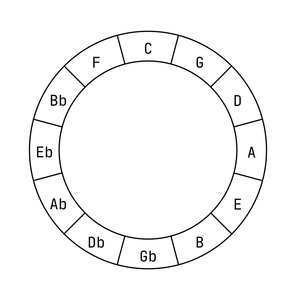
In music theory, the distance between two notes is called an interval. There are many kinds of intervals and each of them has a unique quality. Some intervals sound more pleasant than the others. Some intervals create tensions while the others provide resolutions. One way to organize these qualities is to use the Circle of Fifths.
This is an oversimplified version of the Circle of Fifths, but for the purpose of this project, this will suffice. The letters you see are the twelve unique notes in Western Music. In short, there are only twelve notes and the rest are just variations of these twelve notes.
As you can see, the notes are not arranged in an alphabetical order. In fact, they are arranged in a way so that the neighboring note in the clockwise rotation is a perfect fifth away, and a perfect fifth is an interval. For example, the note G is a perfect fifth away from the note C, and the note Ab is a perfect fifth away from the note Db.
A perfect fifth is an interval that is characterized as stable, calming, and grand, if you will. As a side note, a step counterclockwise will result in a perfect fourth. So, F is a perfect fourth away from C. A perfect fourth also sounds pretty good. For this reason, notes next to each other sound better when played together. On the other hand, notes that are many steps apart on the Circle can make you feel uneasy.
(FYI, the notes on the opposite ends create an interval called tritone. They have their uses in music, but that is out of scope for this project.)
The reason why I bring up the Circle of Fifth is that it gives us a way to look at distances between notes and how they will make us feel. It is an easy way to quantify the quality of intervals. If two notes in our 2D space are close enough and a line is drawn to connect their centers, it is an opportunity to visualize this connection because we now know how stable or unstable these two notes will sound together. We just have to look up their positions on the Circle of Fifth.
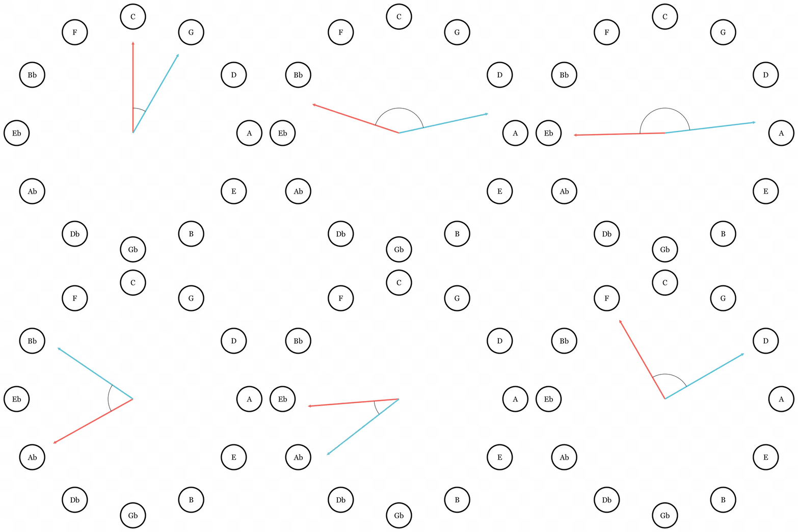
More specifically, we are interested in the acute angle between two notes on the Circle of Fifth, such as this:
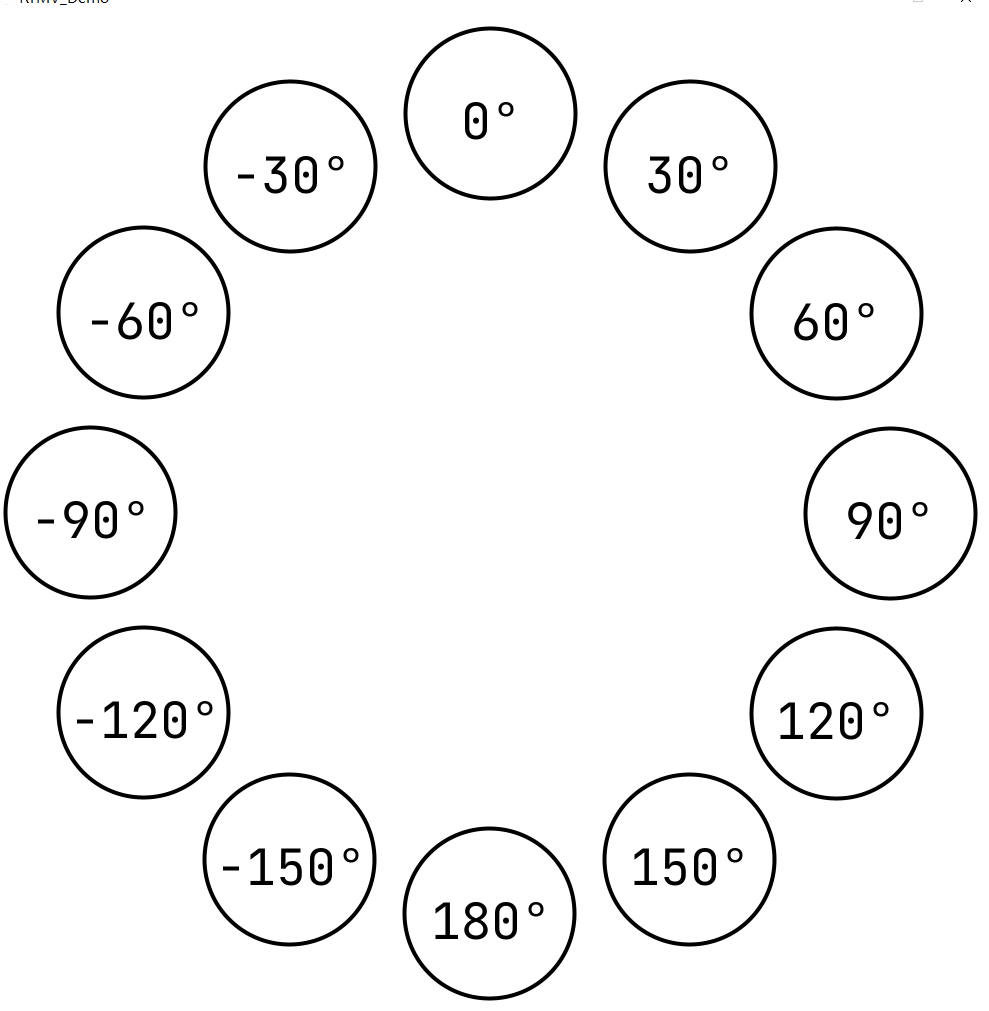
We can generalize all cases we get from the above illustration into a diagram like this:
Here I changed from using steps to angles in degrees, but the concept is the same: a step is just 30° in difference. (360° divided by 12 is 30°.) The farther away the two notes on the Circle, the larger the absolute value of the angle between.
It is important to take time and think about what is happening here. It is the angle between two notes on the Circle that we are interested in, not their absolute positions. This is because the angle tells us the interval. For example, 30° is a perfect fifth, -30° is a perfect fourth, and 180° is a tritone as mentioned earlier.
Different intervals sound differently, so we want to give them different colors to represent that. Again, we are interested in the interconnectedness of notes, not simply the notes themselves.
So at this point, I hope it is obvious enough that the concept of the Circle of Fifth is not so dissimilar to the concept of the color wheel. The closer, the more analogous; the farther, the more complementary.
For that, we can map every interval (or angle) to a color on the color wheel. We first randomly pick a hue for the zero-step interval—also called a perfect unison. (By the way, this is why we always get a different color scheme every time the program runs.) And then, we branch out to find more colors until we exhaust all intervals. Something like this:
Notice two things that are a bit different from the color wheel you may know.
First, the colors are symmetrical. This is because when two notes meet, there can be, and in most cases will be, two intervals. Take C and G. G is a perfect fifth to C, but C is a perfect fourth to G. In music theory, this direction-ness is important. But here we know that the qualities of the two intervals should be the same. Thus, we don’t want to distinguish between clockwise and counterclockwise steps.
Second, the color of a tritone is not really complementary to that of a perfect unison. This is because I’m using the HSV color wheel. It just so happens that the hue in HSV is represented by angles, which is very handy in procedurally picking colors. Although complementary colors aren’t on the opposite sides of the HSV color wheel, analogous colors are still close to each other, which is good enough for us, as you will see later.
The next thing we can do is to limit the range of hues that we use, like this:
See how even the tritone can produce a more harmonious color with green that represents perfect unison, perfect fourth and perfect fifth. But that will become irrelevant as we have one more step to do.
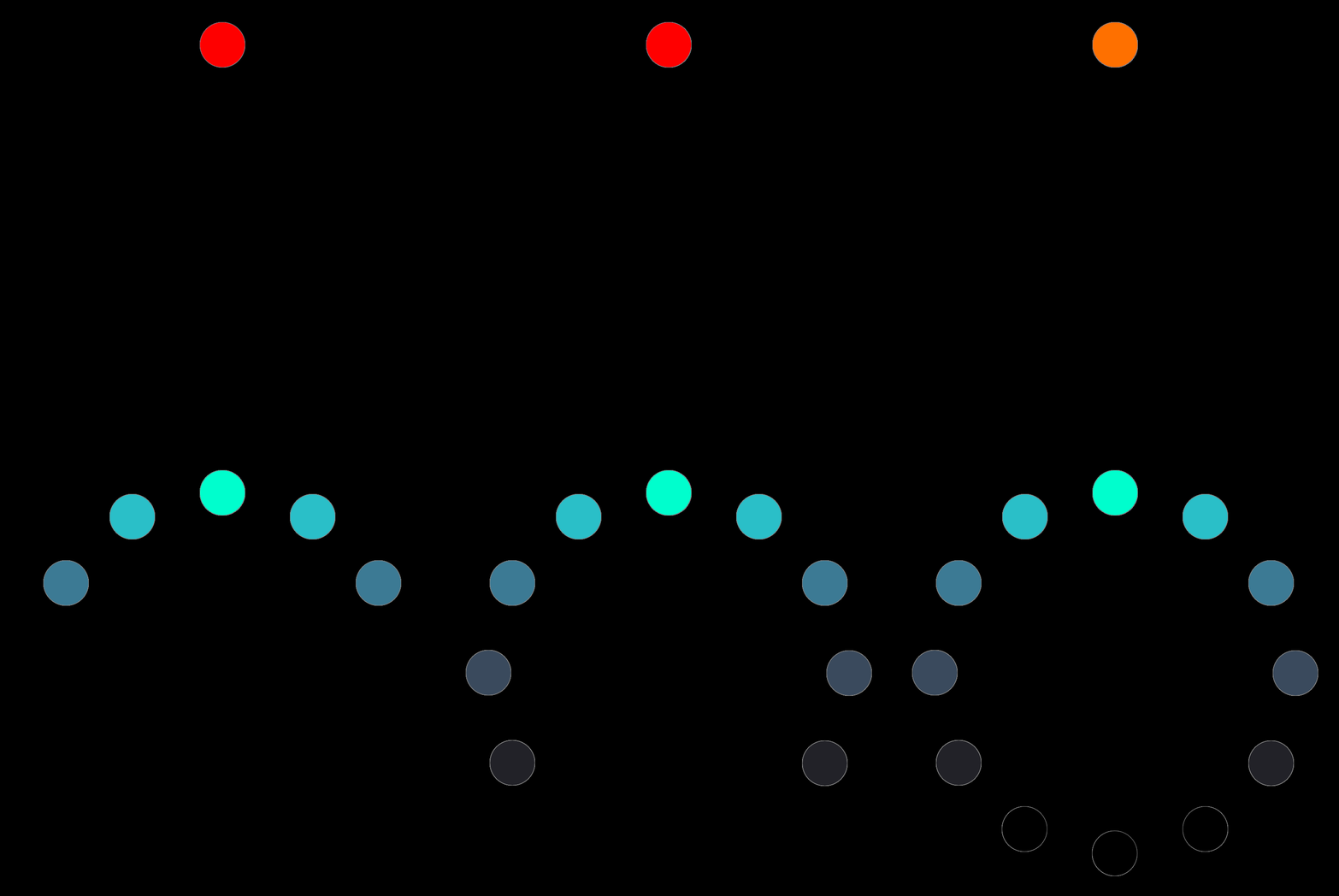
Next thing we will do is to tone down the saturation and value (or brightness) as we move farther and farther from the perfect unison. We can also do the same to the alpha channel as well.
We effectively ignore the more dissonant intervals and only show the intervals that are more harmonious. The lower half of the Circle is pretty much invisible.
With some more fine-tuning, we get what is shown at the top of the page.
Find more technical documentations on the GitHub page.


